View Events in Logic Analyzer
Using the Logic Analyzer
The Logic Analyzer can be used to chart the real time values of up to eight data attributes found in IEDs in the current workspace. Charted values can be saved as part of the workspace for later viewing and can be exported as data files.
Data Sources for the Logic Analyzer
To view a data attribute in the Logic Analyzer, the attribute value must be retrieved through GOOSE or a report. If the value is retrieved as part of a report, the timestamp of the data change must be included in the report. The Logic Analyzer charts attribute values against time based on timestamps received in reported data from IEDs and GOOSE headers from publishers. The time plotted in the chart is not the local PC time at which the signal was received by the application. They are the timestamps from the signals received from the IED (GOOSE/Report).
Adding Data Objects and Data Attributes to the Logic Analyzer
1) Select the Data Miner tool on the left side and select data objects
2) Select the Custom Display on the right side
3) Drag data objects from the Data Miner onto the Logic Analyzer. The data objects will be deconstructed into data attributes which will be added to the Signal Path list.
4) The first eight attributes added to the Signal Path list will automatically have a chart created.
5) The value and timestamp (and quality if available) for the data attribute is retrieved using GOOSE or reports based on how the Data Retrieval Method is set. Note that adding polled data attributes will be reported as an error.
This Figure shows the POS data object for a CSWI being dragged onto the Logic Analyzer. The object can be dropped onto the chart area or on the Signal Path list.
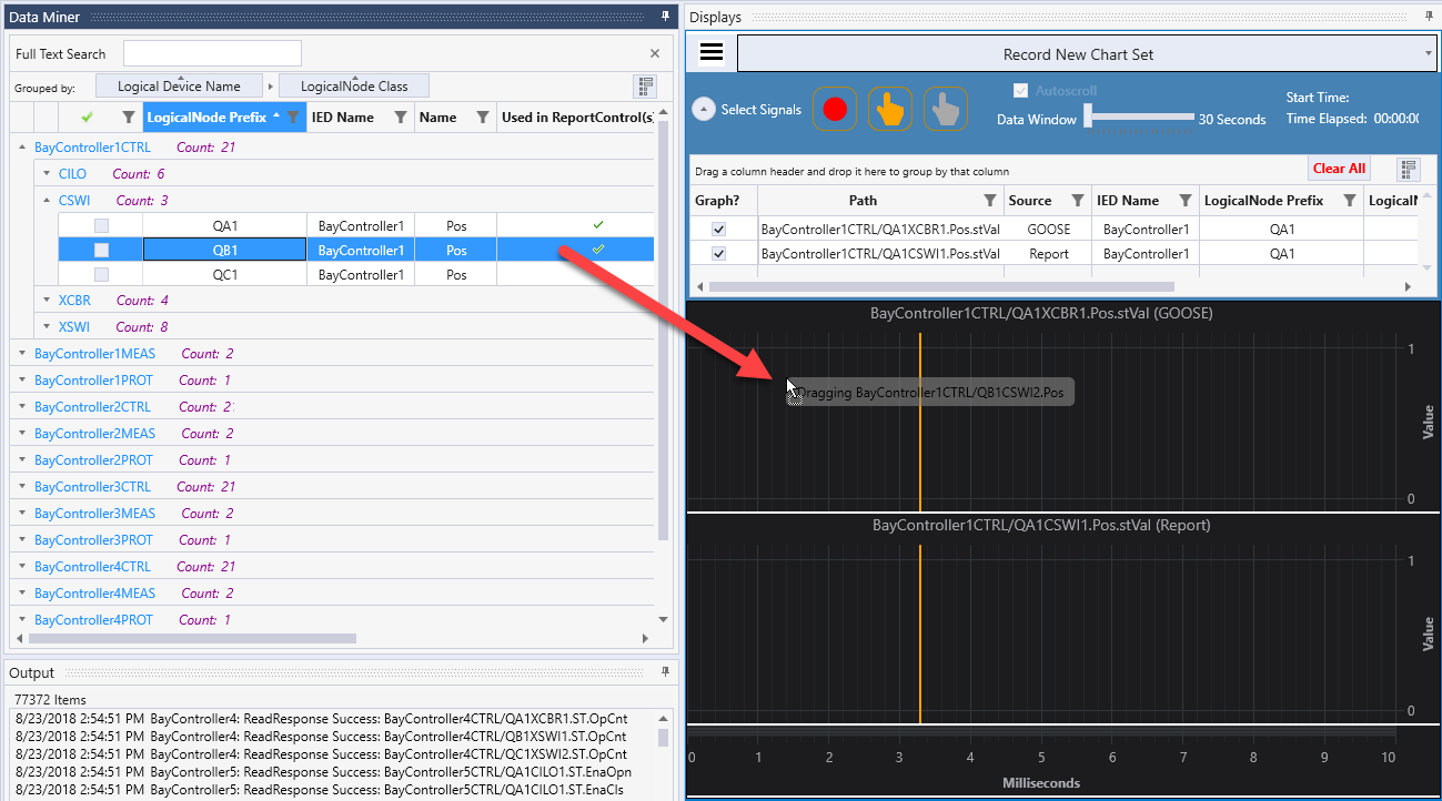
After the object is dropped, it’s corresponding stVal attribute is added to the Signal Path list and a chart is created for the value. Test Suite Pro will open a connection to the IED and subscribe to the appropriate control blocks to prepare to acquire data for the attribute.
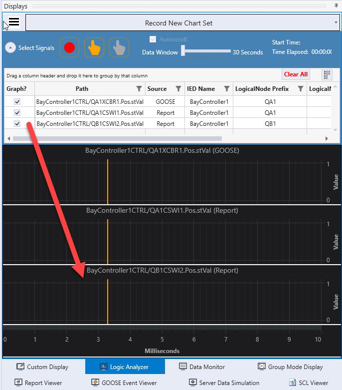
A large number of signal paths can be added to the Logic Analyzer, however only eight charts can be displayed at any time. The check boxes in the column labeled “Graph?” determine which paths are charted. When data acquisition is started, data is collected for all attributes in the Signal Path list, not just the ones that are currently charted. Because of this, charts for any of the signals can be reviewed at any time by clicking the “Graph?” checkbox to view the data even after data collection is stopped.
Acquiring Data
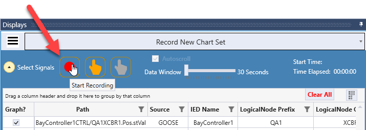
To begin collecting data for the attributes in the Signal Path list, click on the red Start Recording button in the Logic Analyzer control bar.
When acquisition begins, the control bar will turn green and the Start Time and Time Elapsed values become active.
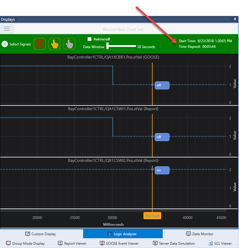
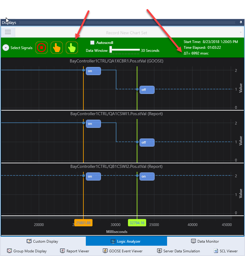
The figure above shows the Logic Analyzer collecting data for three data attributes. In this example, the top two attributes experienced a state change about 30 seconds after the data collection began.
Cursors
The orange, vertical line running across the three charts is a cursor. The cursor can be moved with the mouse and can be turned off with the orange hand icon next to the Start Recording button. A second cursor can be turned on by clicking on the second cursor icon. When both cursors are turned on, the time delta between the cursor positions is displayed in the control bar below the elapsed time value.
Interacting with the Charts
While data is being collected, by default the new values will be displayed on the right side of the charts. This is called Autoscrolling. This behavior can be stopped by unchecking the Autoscoll checkbox in the control bar or by moving the chart with mouse which will disable the Autoscroll function. Autoscrolling can be started again by clicking the Autoscroll checkbox. The number of seconds of data shown in the window is controlled by the Data Window slider. By default, 30 seconds of data is shown. The Data Window slider only works while Autoscroll is enabled. When Autoscroll is disabled, the zoom function controls the amount of data shown in the window.
The charts can be zoomed by using the scroll wheel on a mouse or by pressing the ‘+’ and ‘-’ keys. Additional functions can be found on the context menu for the charts. Right clicking on a chart will show the context menu.
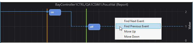
The Find Next/Previous Event menu items will reposition the charts so that the next/previous change in the attribute’s value is centered in the display. The Move Up/Down menu items will reorder the charts on the screen.
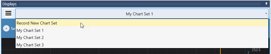
Archiving and Recalling Chart Sets
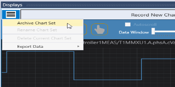
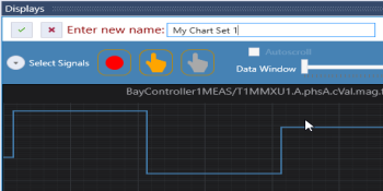
The current set of charts displayed in the Logic Analyzer as well as the data collected for all of the attributes in the Signal Path list can be saved as a named chart set. To archive this set of data, select the Archive Chart Set from the Logic Analyzer menu. Then provide a unique name for the chart set and click the check mark to accept it.
The new name of the chart set will be displayed at the top of the Logic Analyzer display in a drop down box. This box is used to select the archived chart set to view. When viewing an archived chart set, most of the tools are available to manipulate the chart such as zooming and panning however the Start Recording and Autoscroll functions are disabled.
To prepare to start collecting new data, select the item “Record New Chart Set” from the drop down list. This will reset the Logic Analyzer and allow the Start Recording button to work. The Signal Path list is prepopulated with the attributes that were present in the last Archived Chart Set. If these attributes are not correct, delete individual attributes by selecting them then right clicking and selecting “Delete Selected Signals” or delete all of the attributes by clicking the Clear All button at the top of the Signal Path list.
Exporting Data
The values plotted on the Logic Analyzer can be exported to a file using a comma separated value (CSV) format. The Export functions are found on the Logic Analyzer menu and are only accessible when data has been collected and the Logic Analyzer is not currently collecting data. There are two options for exporting data. The data for all attributes in the Signal Path list can be exported or the data for just the attributes currently displayed in charts can be exported.
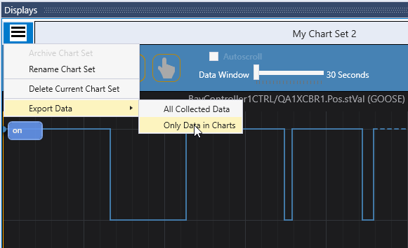
In either case, Test Suite Pro will request the user to identify a file name and directory location for the export file. By default, the file will be given a file extension of “.csv” if no file extension is provided as part of the file name. The first line of the exported file contains column headers which describe the meaning of the values in each of the following rows.
Understanding the Charts
The Logic Analyzer charts are designed to show the value of attributes in an object model as they change over time. The values are those received by the IEC 61850 client running within Test Suite Pro. The client in Test Suite Pro subscribes to reports and GOOSE as need to receive the attributes requested by the user. Charts are organized into charts sets that contain an unlimited number of attribute paths for which up to eight charts can be plotted at a time. When an attribute is charted, the values collected for the attribute are displayed from the time the “Start Recording” button was clicked to the time the “Stop Recording” button was clicked.
The X axis on each chart represents the number of milliseconds that passed from the time that the user clicked the “Start Recording” button until the timestamp included with the received data value. This means that the PC on which Test Suite Pro is running should be time synchronized with the network on which the IEDs are running. Since the data is plotted using timestamp values, all relative measurements between events will be accurate even if the PC is not synchronized; however, an unsynchronized PC could result in values being missed if the local PC clock is well ahead of the network clock since the charts will not plot values that have timestamps that occurred before the time that the user clicked the “Start Recording” button.
Each chart clearly shows the full path of the data attribute that is being plotted. At the end of the path, the source of the data is listed in parenthesis as “Report” or “GOOSE”. If the data is coming from Reports, then the timestamps are read from the dataset in the report. Attribute values can only be charted in the Logic Analyzer if the dataset includes the timestamp and the quality of the signal. If the data is coming from GOOSE, then the timestamp will be read from the dataset if it is available. If the timestamp is not in the dataset, then the timestamp from the header of the GOOSE message will be used.
A number of line styles are used to plot values on the charts. A solid blue line indicates that a value has been received with a “good” quality indicator. A solid yellow line indicates that a value has been received with a quality indicator other than “good”. The cursor will display the quality values for a yellow line.
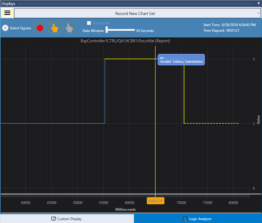
A dotted line indicates that a value has been received in the past and no new information has been received; therefore, the value is assumed to be saved as the last received value. When a new Report or GOOSE value is received, the dotted line is replaced with a solid line indicating the value is now confirmed.
Continuity of data is maintained in GOOSE messages with a state change number which is part of the GOOSE header. The continuity of data in buffered reports is indicated by a buffer overflow flag which is in the report header. If Test Suite Pro receives GOOSE data where the state change number is not properly incremented or receives report data with the buffer overflow flag set, the new data values are shown on the graph but a gap in the line (no line drawn) will appear where the missing data occurred.